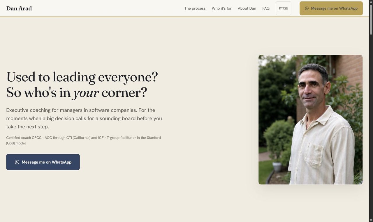
A business card became a decision path. Seven sections, in the order a visitor asks the questions. An AI agent built the options; choosing between them stayed the job.
Sole designer: strategy, copy, UX/UI and front-end delivery
Deliverables
Information architecture, copy, bilingual design system, responsive site
Scope
One client, one stakeholder, four pages, two languages
Process
Content audit and client conversations, not formal user research. Agent-assisted Figma production, screenshot QA
Where it started
A business card, not a decision
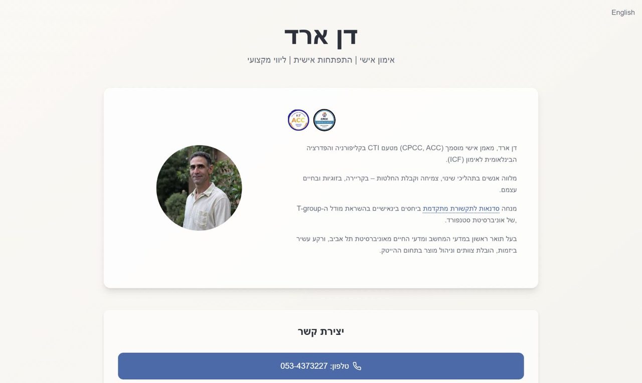
The old site answered one question well: who Dan is. The six that actually decide a purchase went untouched. Two cards, biography and contact, with phone, email and WhatsApp competing as equal actions.
Someone landing here is at a hinge: a role change, a team that stopped working, a decision they cannot say out loud yet. Not another list of certifications. Their questions, in the order they occur.
Before
Who Dan is
Biography and credentials, in one card
How to reach him
Phone, email and WhatsApp at equal weight
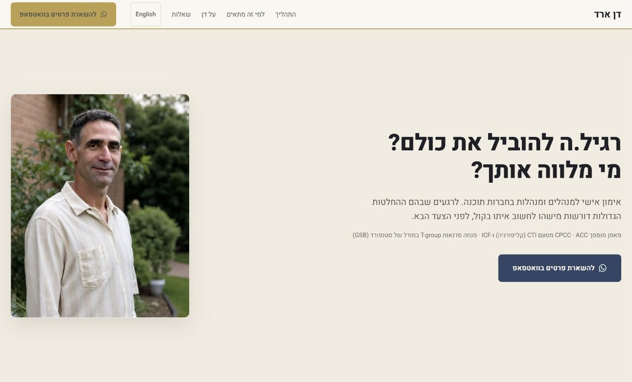
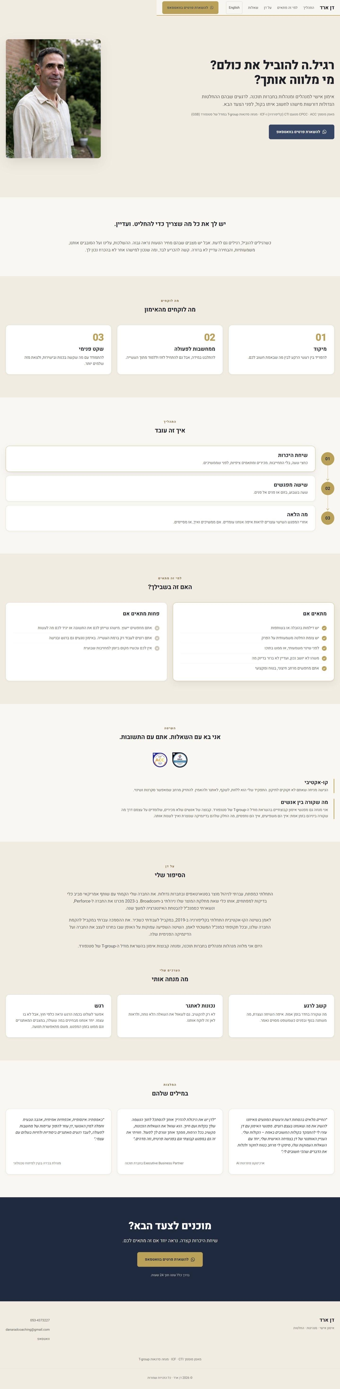
After
רגיל.ה להוביל את כולם? מי מלווה אותך?
Used to leading everyone. Who is there for you?
Does this happen to me too?
What coaching gives you
What do I actually get?
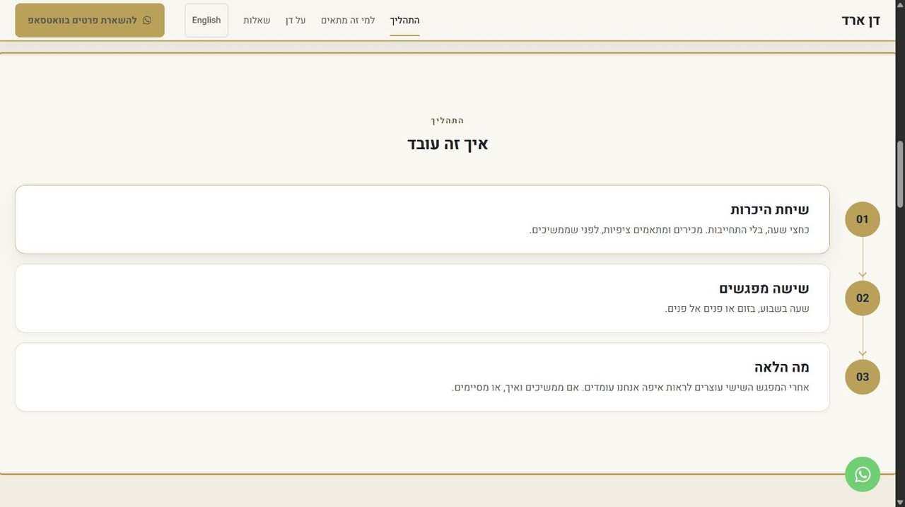
An intro call, then six sessions
What am I committing to?
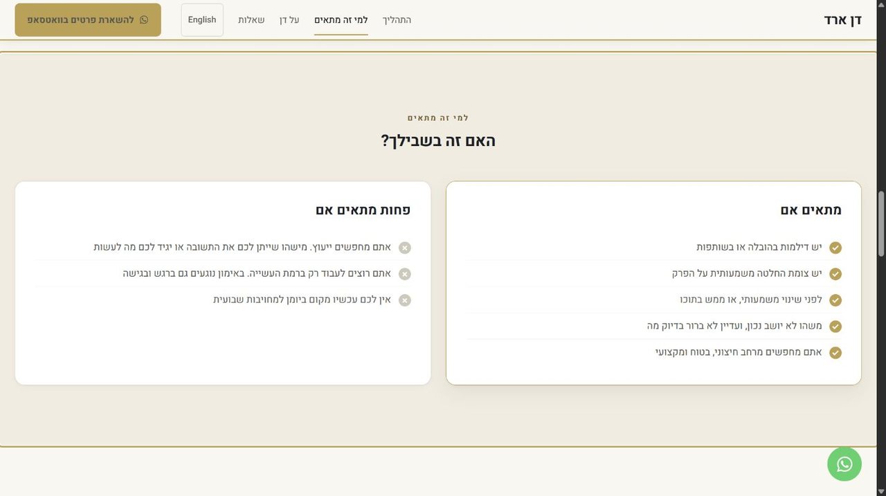
A fit if. Less of a fit if.
Is this for me?
The method, CPCC and ACC
Can I trust him with this?
Dan's own story
Who is he, outside the credentials?
Testimonials, then one WhatsApp action
What happens if I write?
Seven sections, seven questions. The order is the design. Naming who it is not for was the section Dan questioned most, and the one that does the most work: a stated boundary is what makes the rest believable.
Information architecture
Six screens, or one path
Mapping the offer before any high-fidelity UI made the problem visible: six planned screens meant six places to start and none to finish.
First map
Home
About Dan
How it works
Who it is for
FAQ
Contact
Six entrances, no route
→
Shipped
About
Process
Who it is for
Contact
FAQ, kept separate
One route, one exit
Cost of the fold: fewer standalone pages to rank, in exchange for a shorter distance from recognition to trust to action. FAQ stayed out so the home page could read as one story. Hebrew and English share the structure exactly.
Visual direction
Same family. Different subject.
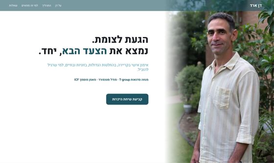
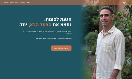
Dan teaches with T-Group Israel and asked to start from their visual language. I did, and stayed closer than he expected. Then I changed the one thing that mattered.
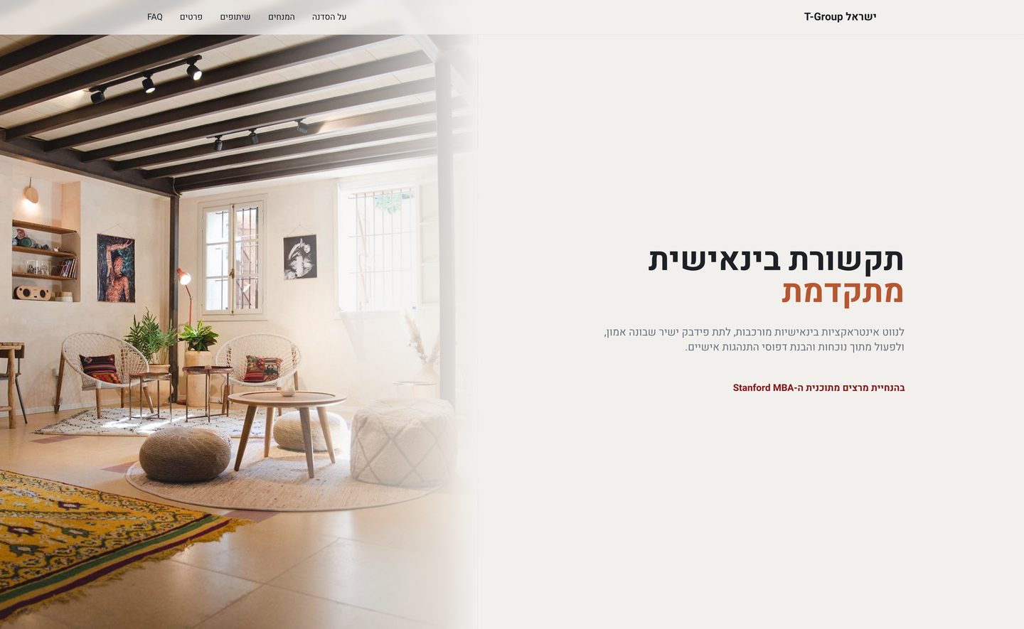
T-Group Israel
The starting point
Dan Arad
Shipped
Background#F2F0ED#F0ECE1
AccentTerracottaGold, used once
The hero image isA roomA person
Authority comes fromStanford, named in the heroThe work Dan did before coaching
The headline isWhat the workshop isA question aimed at the reader
T-Group credentialThe offer itselfOne item in a longer trust line
Two hex values apart on the background, deliberately: someone who has sat in a T-Group room should feel the continuity. The differentiation is not the palette, it is the subject. T-Group sells a room you walk into, so the room is the photograph. Dan sells a person you talk to, so Dan is in the frame. Borrowed authority stayed, demoted to one item in the trust line.
How the palette got there
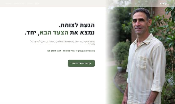
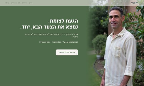
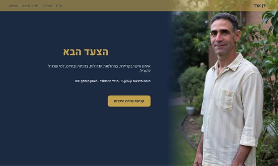
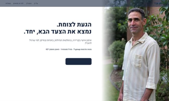
Six palettes on one hero, so colour was the only variable. We took 03. It held at hero size and stopped holding at page size: in full composition navy carried most of the surface and the site read like a consultancy. A palette is a ratio, and a hero does not show you the ratio. The second pass kept the colours and inverted the proportions.
010203040506
Working with an agent
Who built the options, and who picked one
The agent edited the Figma file directly, never autonomously. Left column, material it produced. Right column, judgments it could not make.
The agent didI decided
Built six palettes on the same hero
Which one sells Dan, not which one is prettiest
Bound 457 fills to colour variables, up from two
What each variable is allowed to mean
Propagated one edit across twelve frames and two modes
What counts as good enough to keep
Reported success from the API response
Opened the screenshot and checked, every time
Could build either version of the positioning, perfectly
Which version should exist at all
Options got cheap. The decision did not. The agent cannot see its own output, so it reports success from a response body, not from the frame. Closing that loop by hand is the job.
Where the partner failed
01
Reading a page node returned roughly 73,000 characters and blew the token limit in a single call.
FixNever query a page. Query one frame, by node id.
02
Structural edits broke silently. An absolutely positioned element inside a hug frame is not counted in that frame's height, so the section collapsed and cropped its own content.
Caught byNothing in the API reported it. Only the screenshot.
03
The agent could not decide the positioning. It could build either version perfectly.
SoChoosing which one to build is the job. That part did not get faster.
The system underneath
What the audit changed
Not a feeling that the file got cleaner. A count, before and after.
Measure
Before
After
Fills bound to a colour token
2
457
Spacing values off the scale
43 / 89
0
Colour pairs failing AA
2 / 15
0
Touch target, navigation
31px
44px
Button variants
3
2
Sizes in the type scale
unset
9
The AA fix forced the useful split: gold for small text darkened to #7A6229, gold for surfaces left alone. One colour doing two jobs, the same mistake the hero made at page scale. A good system is not measured in tokens. It is measured in decisions you stop making twice.
Four screens, two languages
Home · Hebrew RTL
The question, before the credentials
Process · Hebrew RTL
An intro call, six sessions, then a real decision to continue or stop
Who it is for · Hebrew RTL
Fit and non-fit, side by side, so the boundary is visible
Home · English LTR
The same structure, mirrored, from one stylesheet
Where it stands
Live, and still an open question
Handed over and launched on 12 August 2026, in both languages. It has been public for hours, not months, so there is no conversion result to report and no honest way to invent one.
04PagesHome and FAQ, in two languages
02LanguagesOne RTL and LTR system
01Decision pathSix planned screens folded into one
TBDMarket signalLive since 12 Aug 2026, measuring from here
Decision
Lead with managers in software companies
What it cost
His advantage becomes legible in one line. Some suitable clients will not identify with the label, and the wider practice sits below the fold.
Still open
Ship the hybrid and measure qualified enquiries
Why
WhatsApp clicks, scroll depth to the fit section and the quality of who writes in will settle it better than another workshop would.
What this proves
Takeaway
The architecture was the design. Which seven questions, in which order, is what turned a business card into something a visitor can act on. The agent made options cheap enough to argue with. It never chose the audience, resolved the positioning, or noticed when a palette stopped working.