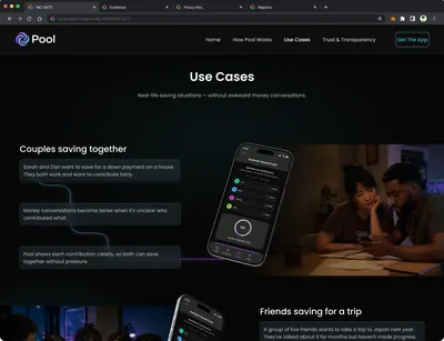
No clear view of who contributed what.
Pool | Collaborative & Personal Savings
I designed a savings prototype where a group working toward one goal can see who put in what, without anyone having to ask.
The problem
Groups saving toward one goal fall back on messages and mental math. Nobody holds a single view of who contributed what, so someone has to ask, and asking about money creates tension. I designed one shared view that updates without check-ins.
Progress feels abstract and unmotivating.
Asking about money creates tension.
Competitive audit
Nine budgeting and saving apps, three of them Israeli, plotted on the two axes that decide whether Pool has a reason to exist.
An app either splits what a group already spent, or tracks what one person is saving toward. None of the nine did both. Pool sits between Splitwise's group mechanics and RiseUp's goal tracking.
Personas and journeys
Five personas, each with a task-by-task journey and a feeling mapped to every step. I built them to stress the model from five directions, not to decorate it.

Maya, 28
Product manager, Tel Aviv. Saving with her partner for a trip.
Wants the split automatic. Will not maintain another spreadsheet.

Omer, 24
Student, Ashdod. Rent and groceries with two roommates.
Needs to try the app before signing up, and to avoid the money conversation.

Shiri, 36
Teacher, Nazareth. Married, three children, tight monthly margin.
Needs Arabic alongside Hebrew, and a view her children can read.

Lior, 31
Freelance designer and musician, Haifa. Income arrives unevenly.
Needs split rules that handle unequal contributions without ranking people.

Moshe, 40
Bookkeeper, Bnei Brak. Six children, filtered phone, no room for error.
Needs a low-graphics, ad-free mode, text entry instead of photos, and a printable summary.
Two of the five point somewhere the prototype does not go. Shiri needs bilingual Arabic and Hebrew onboarding. Moshe needs a low-graphics, printable, ad-free mode on a filtered device. I designed neither. That is the widest gap between the research and the screens, and it is the first thing I would close.
Exploration with Figma Make
I used Figma Make to generate layout alternatives for the two screens that carry the most weight: the saving goals list and the bank connection step. I set the constraints and picked the direction.
Saving goals screen options
Connect Bank screen options
Trade-offs
Three decisions, three costs I took on knowingly.
One structure, two modes
The same structure serves a personal goal and a shared one, so nobody learns the task twice.
Cost Invitations and member visibility had to read as optional in personal mode.
Transparency without ranking
Visible amounts remove the awkward question, so I kept progress and cut leaderboards, penalties and nudges.
Cost Transparency now rests on copy and visual treatment staying supportive.
Bank sync as a choice
Credentials are the highest-friction step in onboarding, so continuing without a bank is a legitimate path, not a fallback.
Cost Less accurate data for manual users, and no cliff before the first pool.
One mental model
Define a target, track contributions, see where things stand. Shared saving is a configuration of personal saving, not a second product.
Information architecture
Onboarding, then a dashboard with five areas under it. I set the depth and access rules before drawing screens.
- Group details
- Create new group
- Manage members
- Group transactions
- Group settings
- Personal goals
- Shared goals
- Create goal
- Goal details
- Edit goal
- Spending analysis
- Saving trends
- Activity feed
- Group actions
- Milestones
- Account info
- Security and two-factor
- Linked banks
- App preferences
Home, Groups, Goals, Insights, Profile
Add money, create goal, start group
Available in groups, goals, and transactions
Notifications and help
Depth
Three to four levels at most, so no screen sits behind a chain of taps.
Access
Add money and check balance stay within two taps of the dashboard.
Navigation model
Tab bar for the five areas, contextual navigation inside them, modal sheets for temporary actions.
User flow
Four decision points between opening the app and reaching the goal. The return paths matter as much as the forward ones, because most of a pool's life happens after the first contribution.
Both paths merge below.
Bank connection sits at the end of setup.
Returns to the pool.
The pool keeps running.
The same pool continues.
AI insights - savings suggestions, goal projections, spending patterns - sit across the dashboard and pool views. They are an enhancement layer, so nothing in the four decisions above depends on them.
Contribution model
One contribution model, role-based and append-only. Four layers govern how money moves and who sees what.
1 - Contribution rules
Each pool defines its own input method and split logic, manual or bank-synced.
2 - Goal tracking
Progress is calculated automatically from validated transactions, no manual updates needed.
3 - Member roles
Visibility and permission rules are set at pool creation, no one can move money without an explicit action.
4 - Transparency layer
Every member sees a shared live view of progress and individual inputs, updated on every validated transaction.
The diagram maps the four layers onto the token architecture, down to the status tokens that drive the response when a payment is late or a goal is reached.
Core interactions
Three interactions carry the model, each answering one failure from the problem above.
Shared progress
Members see who has contributed and who has not, so nobody has to ask.
- Contribution status is visible at a glance (Contributed / Not yet)
- One shared view keeps accountability calm and consistent

Contribution and bank connection
Manual logging and read-only bank sync feed the same model, so the onboarding choice does not change how progress is calculated.
- Start manual, connect later, read-only bank sync is optional
- Progress is calculated the same way regardless of input method


Expense logging and settle up
Shared costs are logged and balanced in the app, so settling up is a step rather than a conversation.
- Quick logging with smart defaults for common shared costs
- Clear settlements when it's time to balance

Marketing site
People do not install a financial app on impulse. They want to know what it will see in their bank first. I designed a companion site on the same tokens, with a Trust and Transparency page that answers that directly.
Results and limitations
The prototype holds one mental model across solo and group saving, shows contribution status without ranking anyone, and keeps bank access read-only and optional. The audit and the personas shaped it. No usability session tested it.
What I would measure
Task success and time on task
Group creation and expense entry, the two flows the model rests on, both named in the goal statement.
Trust score and SUS
A usability scale plus a trust survey. Bank connection spends trust, so trust needs its own number.
Return intent and participation
How many members keep contributing. One active member in a group of four is a design failure, not a user failure.
Limitations
The study was planned, not run
I wrote the research goals, the five research questions and the KPIs. Methodology, participants and script stayed unfinished, and no session took place.
Comparison anxiety is a hypothesis
I removed ranking because I expect visible amounts to invite comparison. I have not watched a group use it.
Bank sync is designed, not integrated
Permissions and the consent screen were designed. No provider was connected, no live data handled.