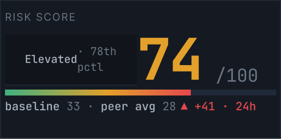
Risk Score
Elevated
78th
pctl
78th
pctl
0/100
baseline 33 · peer avg 28 ▲ +41 · 24h
Incident investigation built around the person behind the alert, so analysts can read intent, not just severity.
One incident. One analyst. Every relevant signal, in a single view.
Three fields the analyst still has to fill in. Press Signal.
Existing tools show a file name, a severity level, and a policy violation. What they don't show is who the person is, whether this was a mistake or intentional, and what the right response actually looks like. Analysts are expected to make consequential decisions about real people, with almost no human context.
Drawn from public research on alert fatigue and SOC analyst workflows (CISA, Gartner).
An alert that says "HIGH RISK" without explaining why, or who, forces analysts to guess. Signal replaces the guess with a structured human profile, a behavioral timeline, and an intent model that makes the story legible before any action is taken.
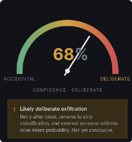
The intent gauge shows a confidence percentage rather than a binary label. Reality is a spectrum. A 30% deliberate score requires a different response than 80%. Showing the number forces precision.
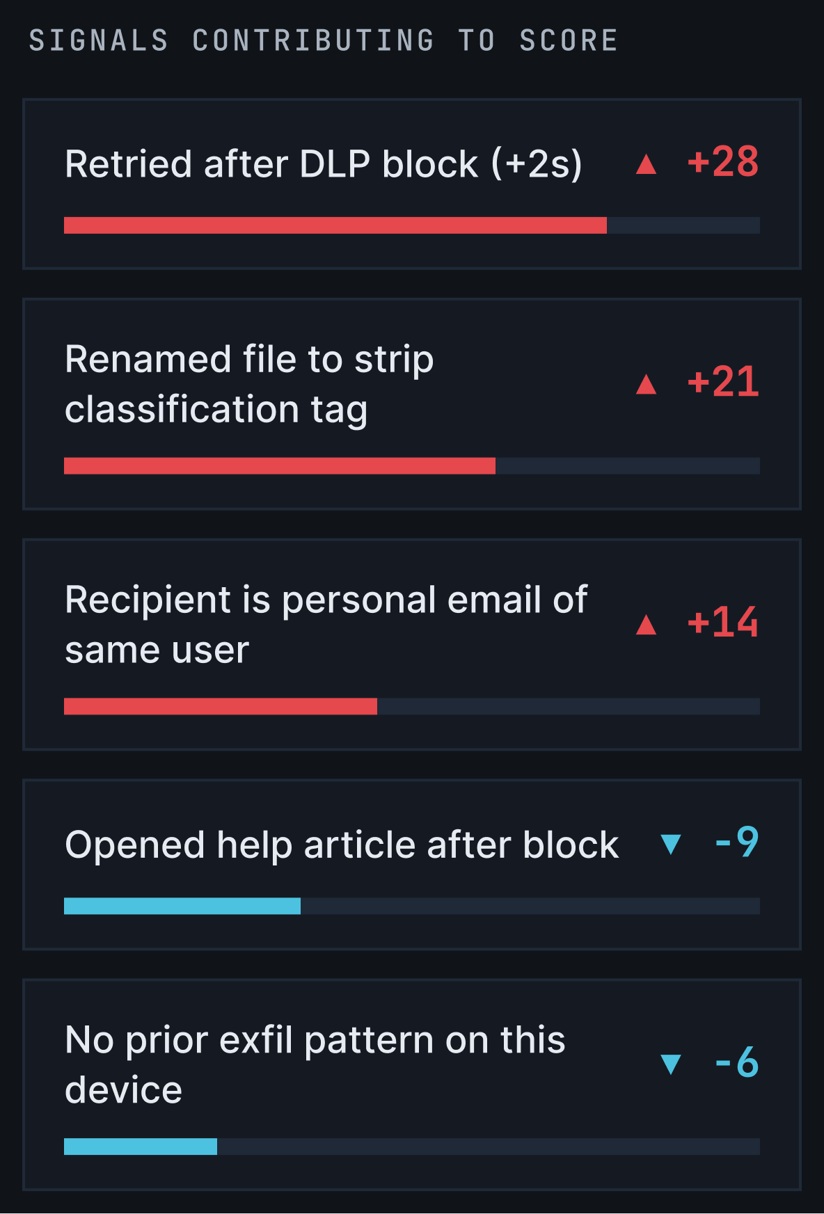
Showing the individual signals that built the score adds complexity. But hiding them would make the system feel like a black box. Analysts need to be able to disagree with the model, so we showed the reasoning.
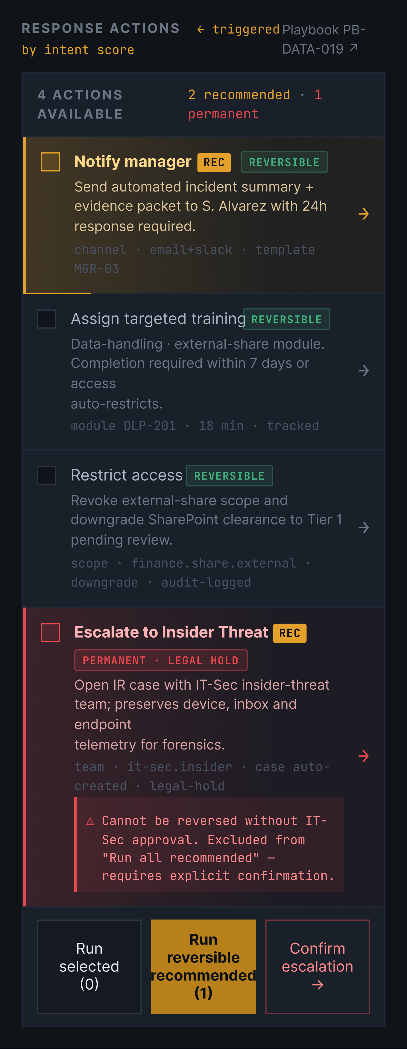
Notify manager and Escalate to Insider Threat are both recommended, but one is reversible and one is permanent. So irreversible actions carry a distinct red treatment, sit outside “Run all recommended”, and require two-step confirmation.
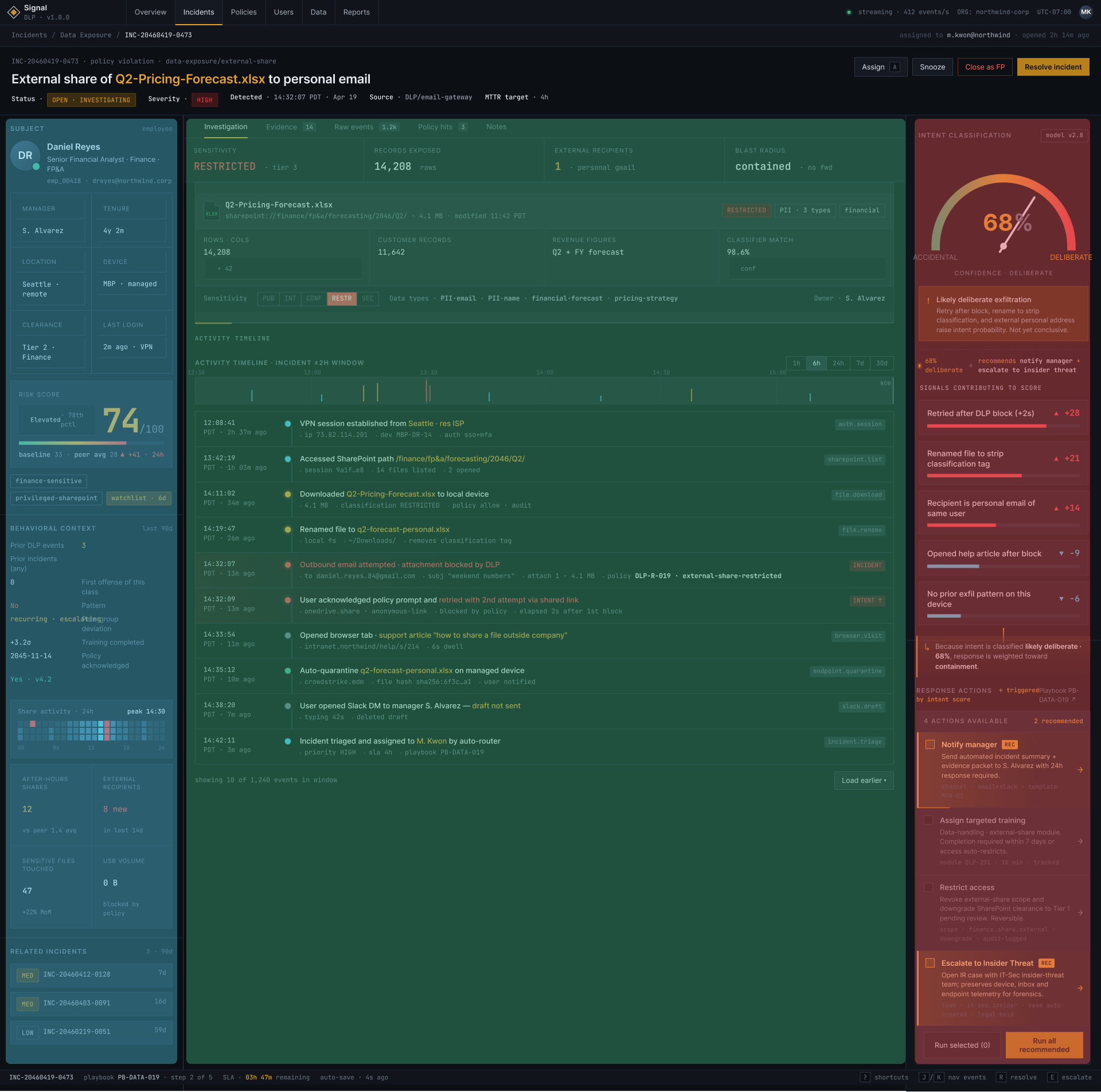
Every column in the layout carries a distinct job. The left column answers who. The center column answers what happened. The right column answers how certain we are and what to do next. Together they replace a single alert with a complete picture.
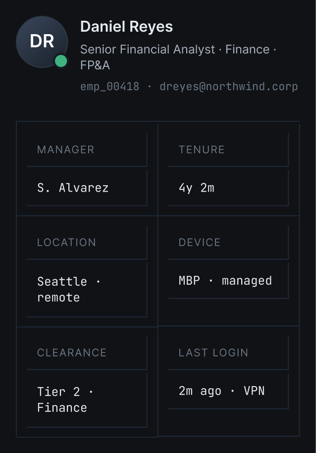
Six attributes that frame how to read everything else. Clearance and tenure aren't description, they're calibration.
The number means nothing without the baseline. +41 above peer average is what makes 74 alarming.
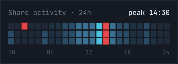
The peak at 14:30 aligns exactly with the incident timestamp. The visual makes the connection before the analyst has to look for it.
USB at 0B doesn't mean safe, it means that route was blocked.
Three incidents over 90 days turn this from a suspicion into a documented pattern.
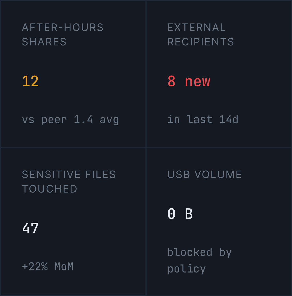
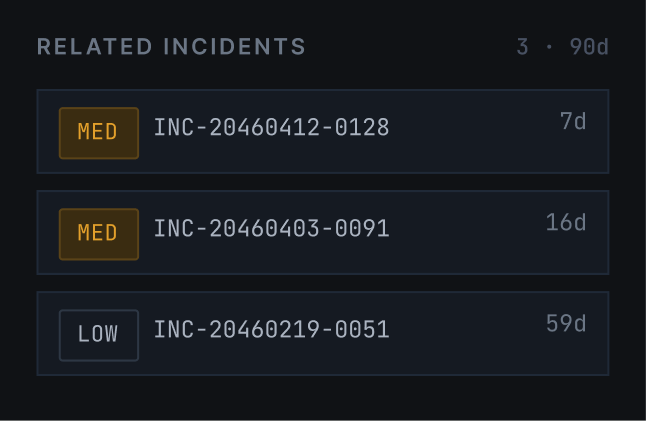
Computed risk fields sit above the timeline, so the analyst starts with severity, scope and containment before reading the event stream.
The file becomes the anchor object. Metadata, classification, and ownership explain why this specific action triggered the incident.
Events from multiple systems are normalized into one sequence, with color used as a fast severity cue.

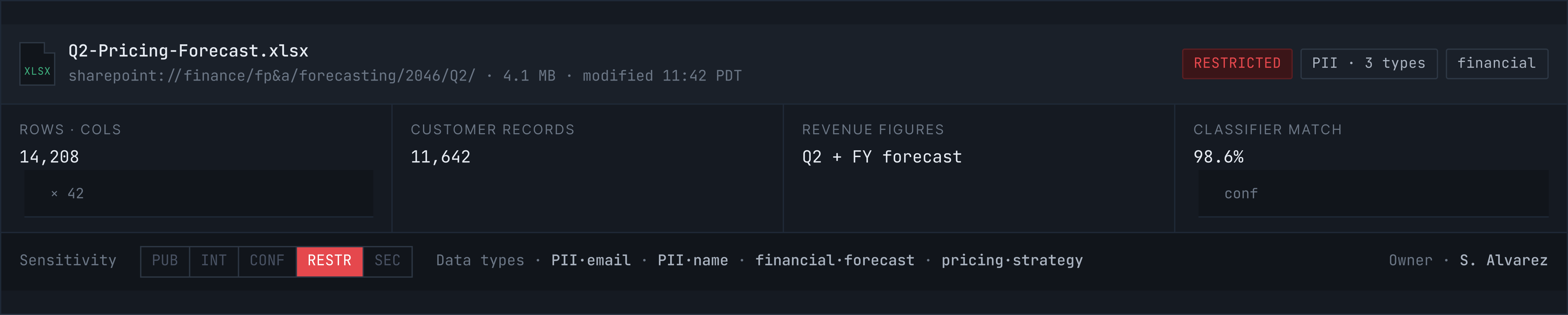
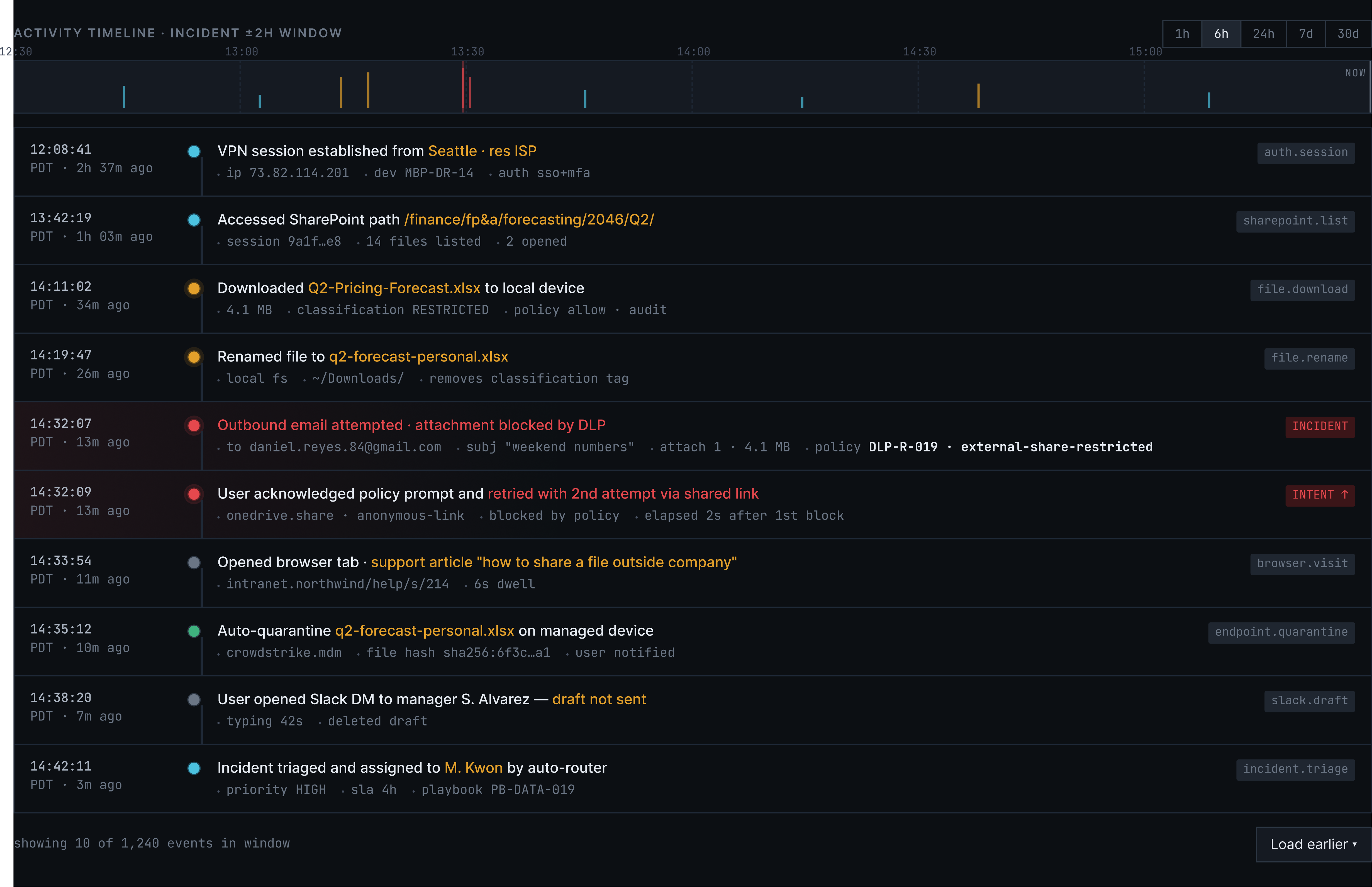
The model output is exposed as an interpretable score, not a black box.
Every contributing signal is shown with its positive or negative weight, so the analyst can challenge weak evidence and override the model.
Response options are ranked from the same evidence model, so the investigation context becomes concrete next steps without taking the decision away from the analyst.
A screen this dense can’t be drawn, it has to be generated. Four rules produce every panel above, three of them the earlier trade-offs turned into something the system enforces.
Four severity tokens, each shipping with a number and a text label, so the screen still reads for a colour-blind analyst and inside a pasted screenshot.
Every aggregate sits beside the weighted signals that produced it. If a number can’t be decomposed, it doesn’t earn a place on the screen.
Four repeating components, one declared state set each. Stale matters most: a signal from forty minutes ago shouldn’t look as authoritative as a live one.
Escalate to Insider Threat opens an HR file on a named employee and can’t be undone. The flag sits on the action, and the treatment follows from it.
A fifth severity step, or an action reversible only inside a time window, means changing the contract rather than adding a colour. Worth it here, where a wrong-looking screen has a person on the other end of it.
Signal demonstrates that enterprise security tools can communicate in human terms without sacrificing technical depth. Designing for data-dense B2B environments doesn't mean accepting visual chaos. It means building structure that holds under pressure. The intent model, the behavioral timeline, and the action hierarchy all speak the language of the domain: they show that good design isn't decoration. It's operational clarity.