Marima | Field guide for political conversations
Marima had a 25-page training document that works. They wanted it as a pocket guide, so I rebuilt it around the three moments a volunteer actually uses it: preparation before, one sentence during, a debrief after.

The brief
Marima trains volunteers to talk politics with people they are close to: a parent, a sibling, someone they will see again at the next family dinner. The method is theirs and it is field-tested.
I was asked to take their 25-page training document and turn it into a digital guide that is easy to use - one that gives a volunteer confidence, and works as a real tool.
The research on volunteers, and the analysis of who they are, came from Marima. They train these people and they know them. What we decided together was to open the guide to readers outside the organisation as well, since it sits on the public web and gets shared. That set the language requirement: every part has to be clear to someone who never went through the training, which is also why the guide carries a short layer explaining why the method works.
How it was built
Five of these six happened. The sixth is the gap I would close first.
Read the document
Map it to moments
Three IA explorations
Two client rounds
Spec, 26 screens
Volunteer testing
Not doneSite map
The structure follows the state of the user, not the stages of the method.
Content that is written and never read is content that does not exist.
Why the old structure failed: everything sat behind “I am in a conversation now” - the state people are least likely to enter

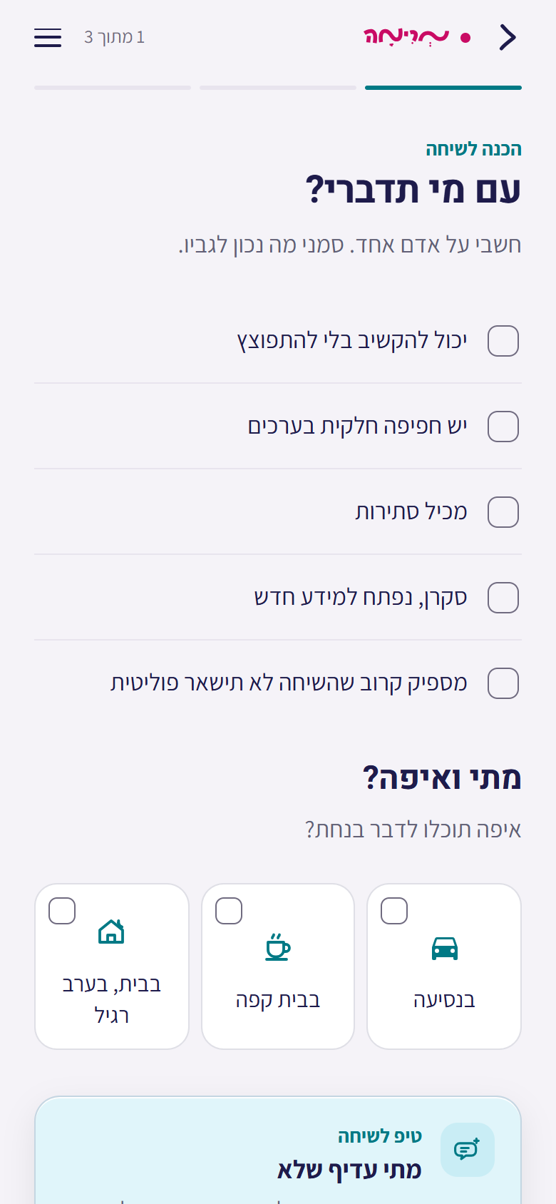
Choosing who to talk to

The story builder

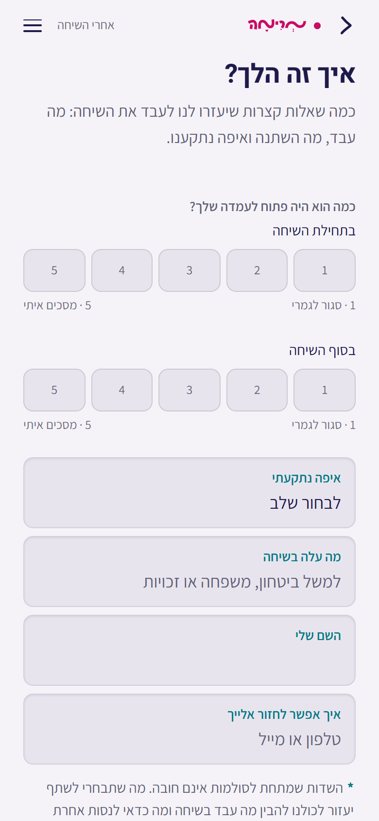
The debrief
When it goes wrong
Most of what this product is for happens after someone has already got it wrong once. Three things carry that: every stage says how it fails, the exit is always one tap away, and the debrief is built for someone who feels bad, not for someone reporting a win.
Moves them out of defence and into talking about themselves. Breaks when you start from an argument instead of the person.
Finds the value or the fear under the position. Breaks when the reflection lands as condescension, which turns it into a weapon.
Puts the policy back into a real life. Breaks when it becomes a lecture instead of one short, specific moment.
Does not stop at “I understand you.” Breaks when you reach for the bridge before there is common ground to build it on.
Reached by topic, not by position in the conversation.
Three lines of the training document, missing from the old site, put back on the route.
Named and contactable, said in one line at the top, not in a footnote.
The organisation supplies the channel. A designer cannot invent one.
Every stage carries a second sentence saying when it fails. Twenty-five pages can teach the method in full; eight seconds needs the failure mode too.
Written with the client from the method they already teach - a reflection in the wrong tone does more damage than saying nothingTrade-offs
Two review rounds reshaped the architecture. Each change bought something and cost something, so here are both sides.
Live support moves down the hierarchy
Client's call · I agreedNobody meets a half-answer at the worst possible moment. A poor answer mid-conversation is worse than none.
The retrieval product I argued for is the one that did not get built.
The stop button leaves every screen but one
Client's call · I agreedIt appeared too often to be taken seriously. Removing it made the one that remains mean something.
The colour rule lost its anchor. I re-anchored it to the route, because a route is a stable property of a screen and a button's presence is not.
Four entries on home, one visual treatment
Client asked · I chose the middleTwo visual treatments read as confusing. One treatment fixed that without flattening home to four bare rows.
Home has no primary action any more. If weight has to come back, it comes back as order and label, not size.
The review note appeared to remove the fifteen-card objection map, but never named it directly. I logged that interpretation as unverified and moved every decision attached to the feature into a suspended section of the decision record. If the feature returns, the work returns with it instead of starting again from zero.
Colour, type and build
Pink was the brand colour and the only colour allowed to mean stop. Once the logo entered every screen that rule broke: a colour that marks danger, progress and brand at once marks nothing.
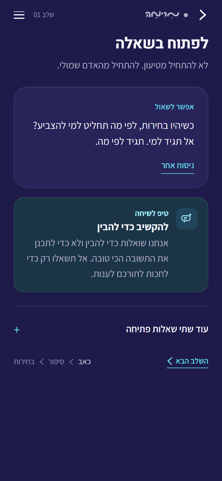
The final rule is based on context, not a component. The logo is pink on preparation, learning and debrief screens, and monochrome throughout the conversation route. On that route, pink is reserved for stopping. The logo became a state indicator, so the brand helps the product instead of competing with it.

Monochrome logo, pink reserved for stop

Pink logo, full-length screens

One screen to screenshot
The 2022 brand book specifies a macOS system font for headings. It does not exist on Android or Windows, so following it literally guarantees an uncontrolled fallback for most of the audience. I followed the intent - thin, quiet headings - on Hebrew web fonts. I got the fallback stack wrong first: it shipped with Georgia, which contains no Hebrew at all.
What was handed over
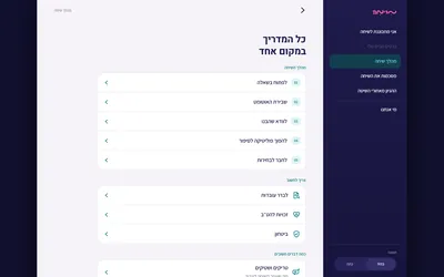
The no-chrome rule belonged to the conversation route, not to desktop. Nobody opens a laptop mid-argument with their mother. Sidebar and mobile sheet come from one source.

App shell, navigation visible

A reading column, capped at 72 characters

A sheet from the bottom, in thumb reach
Accessibility audits
I ran two automated checks. Both returned zero findings. Both were wrong.
Both times the CSS was fine and the query was the defect. A check that returns zero findings is evidence about the query, not the work. Now I write down what a check cannot see, at the moment I write the check, and I fix the generator rather than its output.
Results and limitations
The guide is now live. I still do not have usage data or evidence from volunteer sessions, so launch is the outcome, not proof that the structure works in the field.
Two signals would test the need rather than the interface: how many finish the preparation route, and how many come back after a conversation.
What I would measure · eight seconds set the layout, so it should be the number that judges itLimitations
I have not spoken to a volunteer
Grounded in the source material and deep canvassing research. A defensible foundation, not the same thing as knowing.
The three moments were not measured
Ten minutes, eight seconds, thirty seconds are targets I set. Enough to split the brief. Never observed.
One brief is mine, not theirs
Security came up as a topic volunteers get asked about, and the 25 pages had no section on it. I drafted one so the structure would hold. The organisation has to own that content before it ships.
The strongest artefact here is not a screen. It is a decision record where every conclusion carries its reason. A conclusion without a rationale regresses in the next round. It let a colour rule survive when its trigger disappeared, and made the cost of each client request visible in time to act on it.
Marima, Israeli NGO
Solo. Research, IA, design system, 26-screen spec, decision record, client presentation.
2026, launched ahead of a national election.
Figma, Hebrew RTL type system, a Python build script generating the running app from the spec.