"I just want to know what I'm entitled to without feeling like I need a law degree to use an app."
- Spends hours searching for health benefits he may already qualify for
- Complex navigation and bureaucratic language trigger cognitive overload
Designed a state-driven AI assistant that helps Israeli citizens discover and manage their social rights, with a focus on accessibility, transparency, and trust.
Israel's government services are fragmented, jargon-heavy, and increasingly digital-first. For two large population groups - seniors and new immigrants - this isn't inconvenient. It's exclusionary.
"I just want to know what I'm entitled to without feeling like I need a law degree to use an app."
"I can build a bridge, but I can't decipher this one-page letter from the tax office."
Our initial assumption: users need more information. What we found: they need interpretation and confidence to act. The information exists on platforms like Kol Zchut. The barrier is linguistic complexity and the anxiety of acting on something you don't fully understand.
Different tasks require different levels of AI involvement. The system separates deterministic processes from open-ended interpretation and routes each to the appropriate interaction model.
Both models feed into the same underlying rights database. The interaction layer adapts; the data layer doesn't change.
In a civic context, an AI that presents uncertain information with false confidence causes real harm - missed deadlines, wrong claims, financial loss. The system uses a three-state confidence model to make uncertainty visible before the user acts.
Portion response detected. User sees inline coupon state. Advisor queue entry created with full context.
Escalation is a designed transition, not a fallback. The user sees the boundary before they hit it.
Structured flows reduce cognitive load for deterministic tasks. Conversational AI handles ambiguity. Separating the two prevents the system from feeling unpredictable.
Showing confidence states adds cognitive overhead. But hiding uncertainty in a civic context causes more harm than complexity. We chose to show the seams.
Routing to a human advisor could feel like failure. We reframed it as a designed transition: the user sees the boundary before they hit it.
To minimize cognitive load, the system acts as a "translator" between human natural language and complex bureaucratic requirements. Instead of forcing users to navigate through tedious forms, an LLM engine processes unstructured input - such as voice recordings or free text - extracts relevant entities (dates, names, statuses), and maps them directly into structured form fields. This architecture preserves the simplicity of a conversation while delivering the precision of a structured legal document.
Voice recordings or free text input from the user.
NLP identifies intent and extracts key data entities.
Data is automatically injected into standard form fields.
Each screen resolves a specific tension between accessibility and trust.
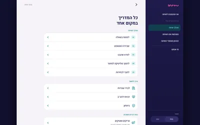
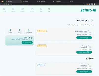
What This Argues: A senior user can understand their rights status, pending actions, and new entitlements at a glance without navigating menus.

What This Argues: Voice input isn't a feature. It's an accessibility requirement for users who find typing in bureaucratic contexts intimidating.

What This Argues: A new immigrant can resolve white-envelope anxiety in under 60 seconds.

What This Argues: When the AI reaches the edge of its competence, the handoff to a human is visible, designed, and context-preserving.
What This Argues: The system's value isn't just answering questions. It's proactively surfacing entitlements users don't know to ask about.
Zchut-AI demonstrates that designing for extreme users - those most excluded by existing systems - produces a better product for everyone. The dual interaction model, confidence-tiered AI, and escalation system aren't accessibility features bolted on. They're the core architecture.
The project also argues a broader design thesis: AI in high-stakes civic contexts requires a trust layer, not just a response layer.
Four moderated usability sessions, June 2026. I tested an interactive prototype with four participants: two Israeli-born seniors (Simcha, 76, former chemical engineer; Tami, 72, former kindergarten teacher) and two immigrants from Russia (Yevgeny, 58, musician, who has a mobility disability; Genia, 54, musician, whose husband is disabled). Sessions used a Wizard-of-Oz setup with canned AI responses, so the tests measured comprehension and trust - not AI accuracy.
Every participant read the "!" as a warning - but the sub-text said no action was needed. The contradiction undercut the one mechanism the product is built on.
"What does this '!' want from me? If there's nothing to submit, why is it there?" - Tami


Reserve "!" for states requiring action. Use a neutral info icon for informational states.
Both immigrant participants looked for a disability option, didn't find it, and picked a workaround. The two Israeli-born participants never noticed - the gap was invisible to anyone who didn't need it.
"Ask me if I have a disability - that's the most important thing to me." - Yevgeny


Add disability as a first-class onboarding category, at the same level as immigration status.
No participant accepted the app as final authority. All four planned to verify with the National Insurance Institute. Specific numbers built more trust than general statements.
"608 isn't a round number someone made up. It looks real." - Tami


Frame the AI as the starting point - link to the official source as part of the core design, not a footnote.
Two smaller issues worth noting
Keyword and category search did not match users' mental models. Most participants reached their answer only through the voice tool - which not everyone discovered without prompting. Separately, the "who is eligible" list did not make clear whether all conditions or just one are required. Both issues are addressable; neither rose to the level of a structural finding.
The disability-category gap was invisible to participants who did not need it. The "!" finding came from all four people independently. Testing with the most-excluded users surfaced problems no persona document would have predicted.
Getting the signal wrong does not just confuse users. It erodes the one thing the product is trying to build. A visible, well-calibrated trust layer is not a nice-to-have - it is the mechanism.
This was a small qualitative study - 4 participants, not statistically representative. The prototype used a Wizard-of-Oz setup with canned responses, which means findings reflect comprehension and trust, not AI accuracy. I distinguished genuine design problems from prototype-wiring artifacts before drawing conclusions.